
This used to be a Jesus Christ Fresco that somebody tried to restore, she should probably have left it to the pros. I like how the background color of gray and how it emphasises the "person" and brings it out. Even though it is not the right painting.
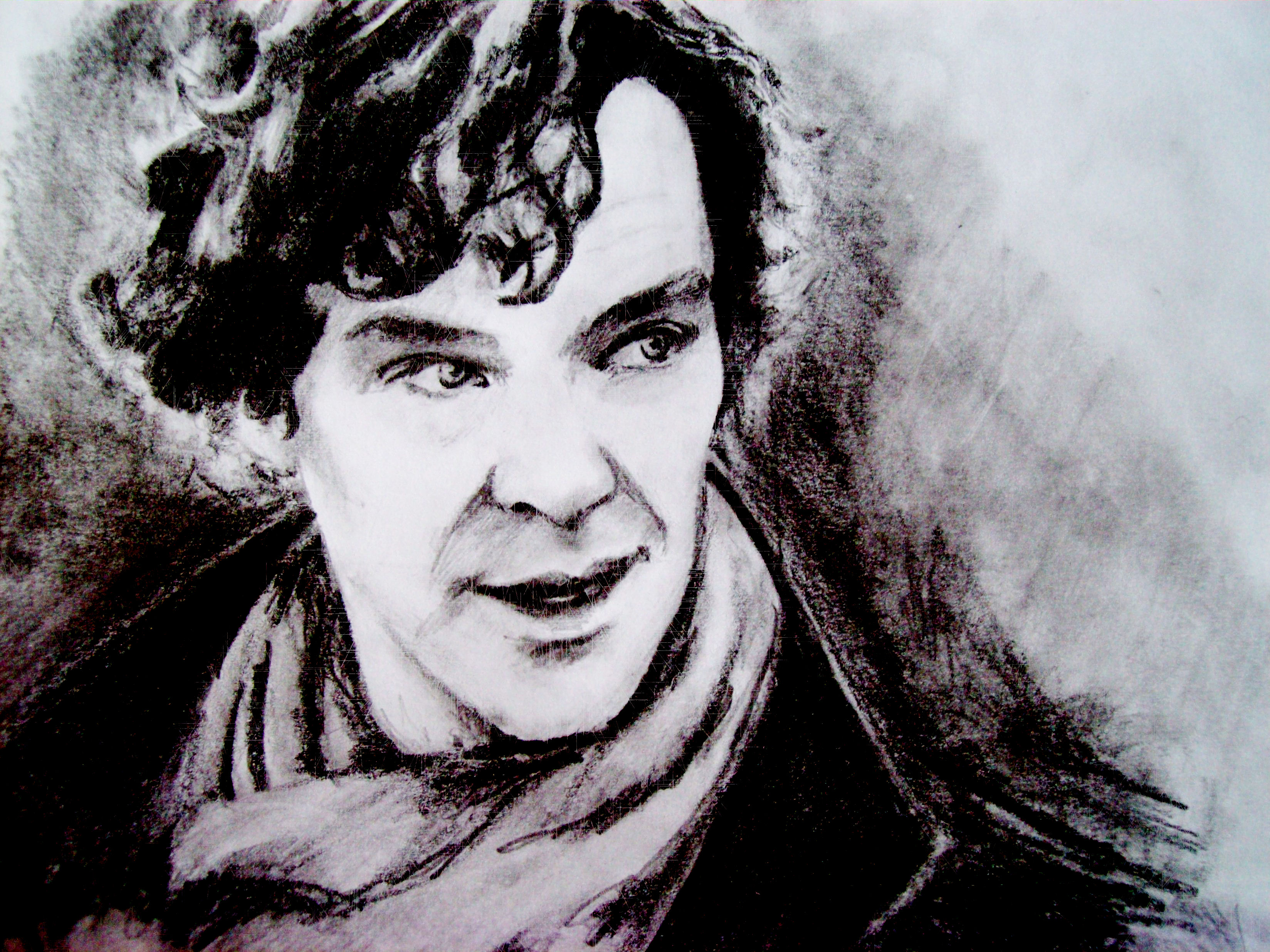
This is Sherlock Holmes from Sherlock, I like how around him the shading is dark but then goes lighter and how it brings out the shading on his face.
|

This is another picture Sherlock, I like how it goes from dark to light like the person isn't quite done finishing it.
|

This is a drawings of the Doctor in his regenerations from Doctor Who. I like how the artist drew them comic book style, and how the colors go with each other.

This picture is of all the Doctors and their companions, I like how she did the shading, and how everyone is looking like they're looking at you.

Sherlock Holmes and Dr. Watson, I like how in the background is far away, and Sherlock and Watson are standing close, and how their dark clothes contrast against the lighter background.
|
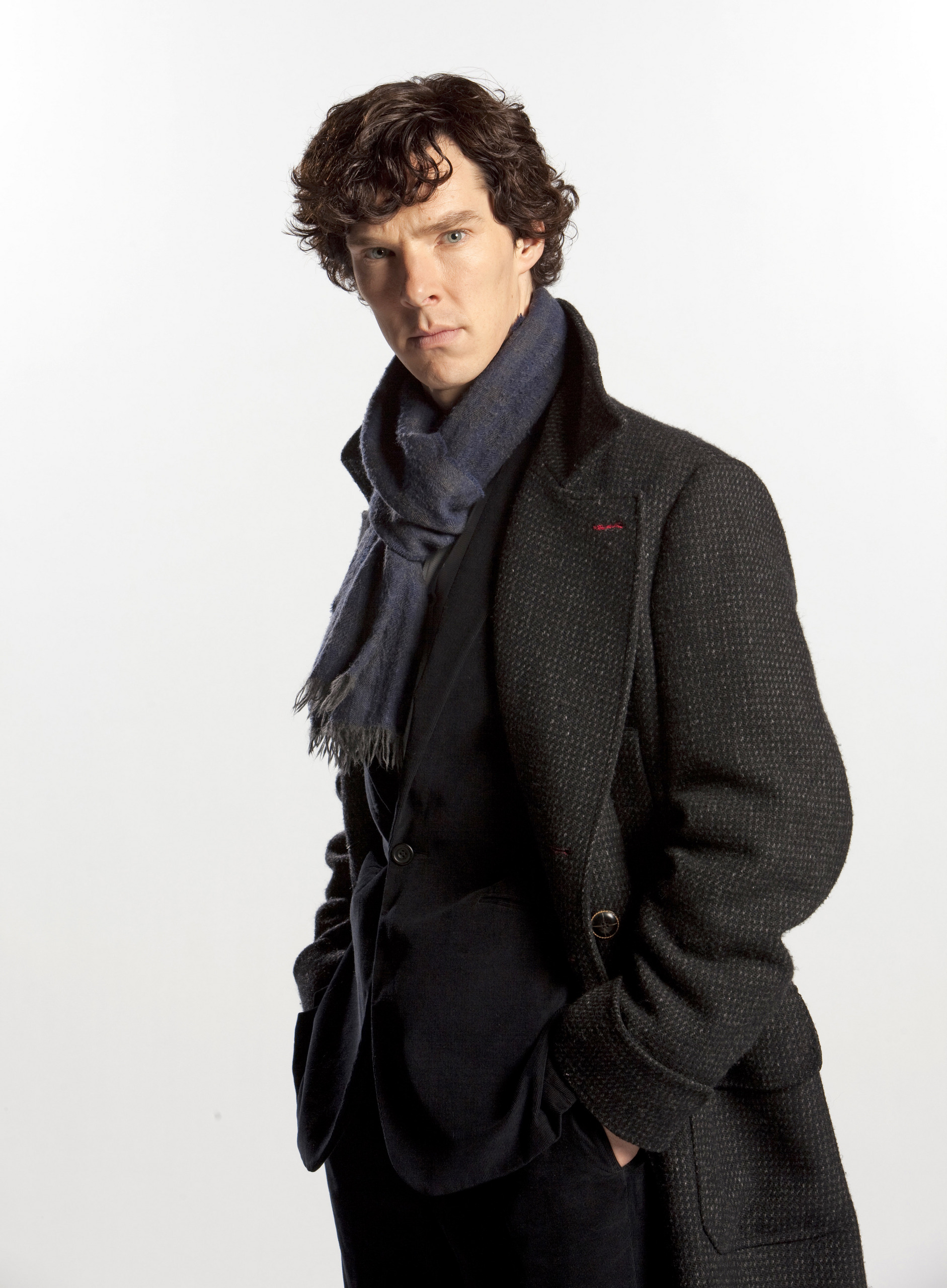
I like how Sherlock's dark coat and hair contrasts against the white background.
|
Jeremy Brett as Sherlock Holmes, I like how there's what seems to be clouds in the background and how you can see the clouds in his face.
|

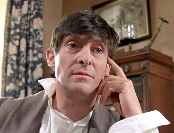
This is Jeremy Brett who also plays Sherlock Holmes in the 1984 version, I like how the background in all the way in focus and Sherlock's head is in focus so it stands out more.
|
I like how Sherlock's in the same position as in the last picture but is sitting in a different place, and his hair is shaggy opposed to how he regularly has his hair, and again the background is a bit out of focus but Sherlock is not so he stands out just a bit.
|

Here is another picture of Jeremy Brett as Sherlock, and another one of those pictures of clouds in the background, I like how the shade of the color yellow has unity with the color gray.
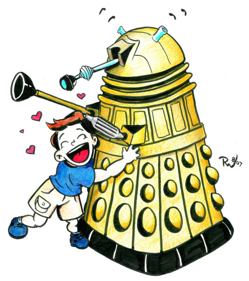
I like how the little kid is hugging the Dalek even though Dalek are usually aliens who want to destroy races that are not their own, I also like the bright colors.
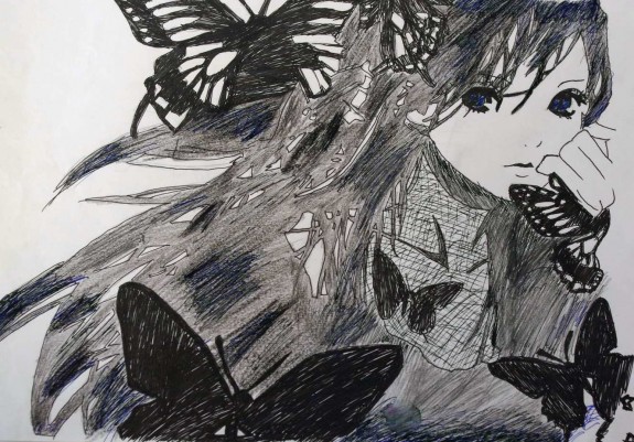
I like how the artist added butterflies to the drawing of the person, I also like how the background is white, the person is gray and the butterflies are black.

I like how the camera is also a house. I like how the background is black and the drawing is gray so it stands out against the background.
|
Jeremy Brett as Sherlock, I like how there is a background of rooftops then clouds then Sherlock, I also like the unity of the colors.

This is a drawing of a chef ready to cut off the artist's hand, I like the shading and how the drawing is combined with a real hand.

I really like this picture because it combines 2 of my favorites TV shows together, I also like unity of all the dark colors.
|

I like the unity of the colors, and how the wings are just slightly darker than the page.

I like how the drawings are on a actual chalkboard, and how each drawings represenst what the person is thinking.
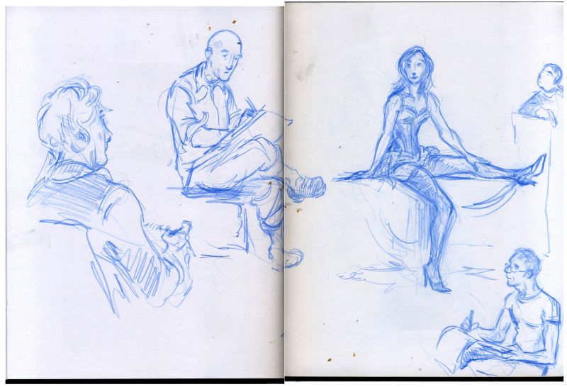
I like how is a portrait of people drawing portrait of a person, and how the person sketched the drawing in blue.
|

I like how her hair makes a heart, and how the gray contrasts against the white, and how the picture because she is crying, along with the heart may signify that her heart has been broken.
